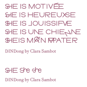
Typography is a key element of written language, as it shapes the way the signs that compose language are constructed. And like language, these constructions bring with them many cultural codes and shapes charged with political implications. Each typographic style carries historical and cultural references – codes that can be read by specific communities as appealing, exciting, welcoming… Or not.
I recently wrote about the so-called International Typographic Style, also known as the Swiss Style which is a vocal example of how dominant Northern-Western countries and cultures imposed their way of shaping things, devaluating and even erasing many local and indigenous styles and scripts. The Swiss Style is still often presented as neutral, with its star typeface Helvetica.
There are many sorts of binaries that need to be deconstructed in the field of typography: the neutral-modernist-classical canon vs. decorative-feminine-kitsch-exotic forms, the Latin script vs. what is commonly called «non-Latin» scripts… A work in progress to dismantle the asymmetric power relations between the norm and the «other».
Another binary is embedded into language: gender binary. In alliance with the development of (new) propositions of inclusive writing in different language, communities and countries, a recent movement in typography is tackling the issue of inclusive and gender-fluid language through typographic experiments.

Inclusive and non-binary initiatives are not centralized, homogeneous, nor do they propose one unique system. Not a new norm. They are led by collectives and individual designers, who are looking in different directions for alternative tools to make and think typography. They propose forms that escape the masculinisation of some languages or their rather binary solutions. They change the form of existing letters and signs, work on ligatures, merging two of more letters into one character. And they even propose new letters!
These initiatives are very language-specific, which is quite interesting in a field in which a fake Latin text is often used to present the letters design – as a kind of «neutral» tool to be able to look at them: Lorem ipsum dolor sit amet, consectetur adipiscing elit, sed do eiusmod tempor incididunt ut labore et dolore magna aliqua…
Not all languages have the same gendered grammatical constructions. My mother tongue, French, is very gendered, and has been highly masculinized since the 16-17th Centuries. At that same time, the printing press and typography as we know it today imposed themselves in Europe and beyond. My great-grand-mother tongue, Armenian, isn’t that gendered and I had to (un)learn that ան է means both she is and he is… My brain can only try to understand what it really means since it escapes the binary logics. The same goes for other languages I met in my life, such as Farsi or Pulaar, whom speakers had to learn to gender people and sometimes things when learning French, English, Italian or German.
Creating new letters and signs means at some point finding a space in a normalized system (Unicode). It is a reality that many scripts are struggling with, trying to fit in boxes designed for a patriarchal Latin script. Trans-language and multi script alliances are necessary. An intersectional dimension to the question of inclusive typography in which questions of validism should also be welcomed in the party towards more inclusive typographic dancefloors. The more the merrier!
